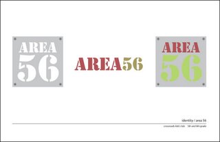
are all in the same family but will be used in different settings...some are
for signage and others are better in print pieces (parent letters, brochures,
etc.) and then some are for the female portion of the population. interesting
thing i learned from d-val is that for church stuff the stuff should be
deliberately created to be attractive to men...since men are less likely to
feel comfortable enough to come...women don't care and will come regardless.
the rule stays true for the younger kids too.


No comments:
Post a Comment